I got the opportunity to do volunteer work for The Shenandoah National Park Trust to create a visual brand identity, as well as implement the new identity on a few new collaterals.
The Shenandoah National Park Trust is the official philanthropic partner of Shenandoah National Park, the Trust invests in programs and initiatives which help ensure that Shenandoah remains a crown jewel of the Park Service, an economic driver for the region, and a national treasure for all to enjoy, for generations to come.
The challenge was to create an identity that will bring the apparent nature and outdoor feel of the national parks into a more professional and corporate tone of voice. The tools developed ranged from term reports to hiking trail guides, and my task was to find a middle ground.![]()
The Shenandoah National Park Trust is the official philanthropic partner of Shenandoah National Park, the Trust invests in programs and initiatives which help ensure that Shenandoah remains a crown jewel of the Park Service, an economic driver for the region, and a national treasure for all to enjoy, for generations to come.
The challenge was to create an identity that will bring the apparent nature and outdoor feel of the national parks into a more professional and corporate tone of voice. The tools developed ranged from term reports to hiking trail guides, and my task was to find a middle ground.

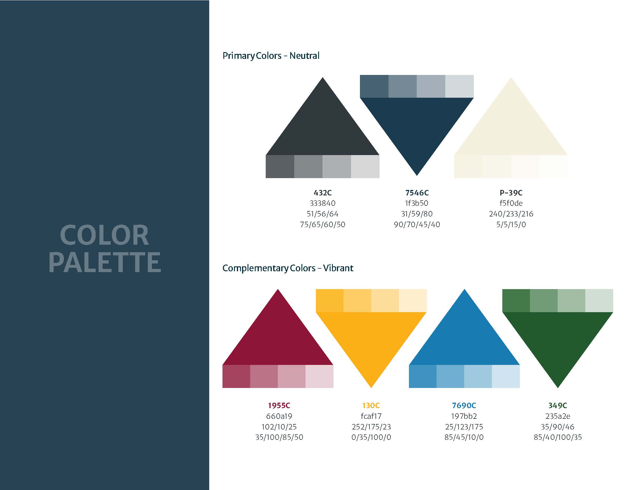
The brand guidelines needed to be sculpted around the original logo. Though I did tweak it by updating the fonts into a more modern typeface, the logo remained more or less the same.




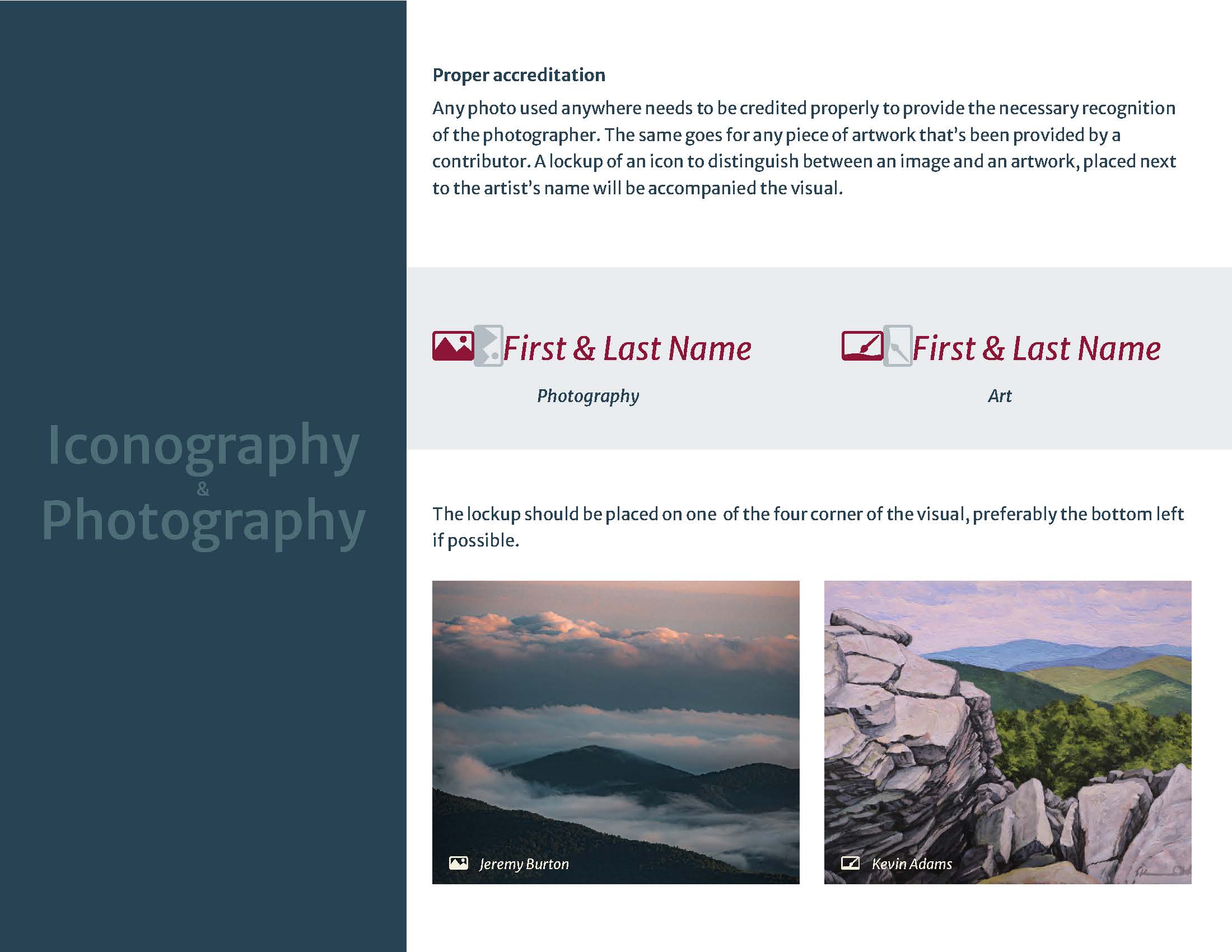



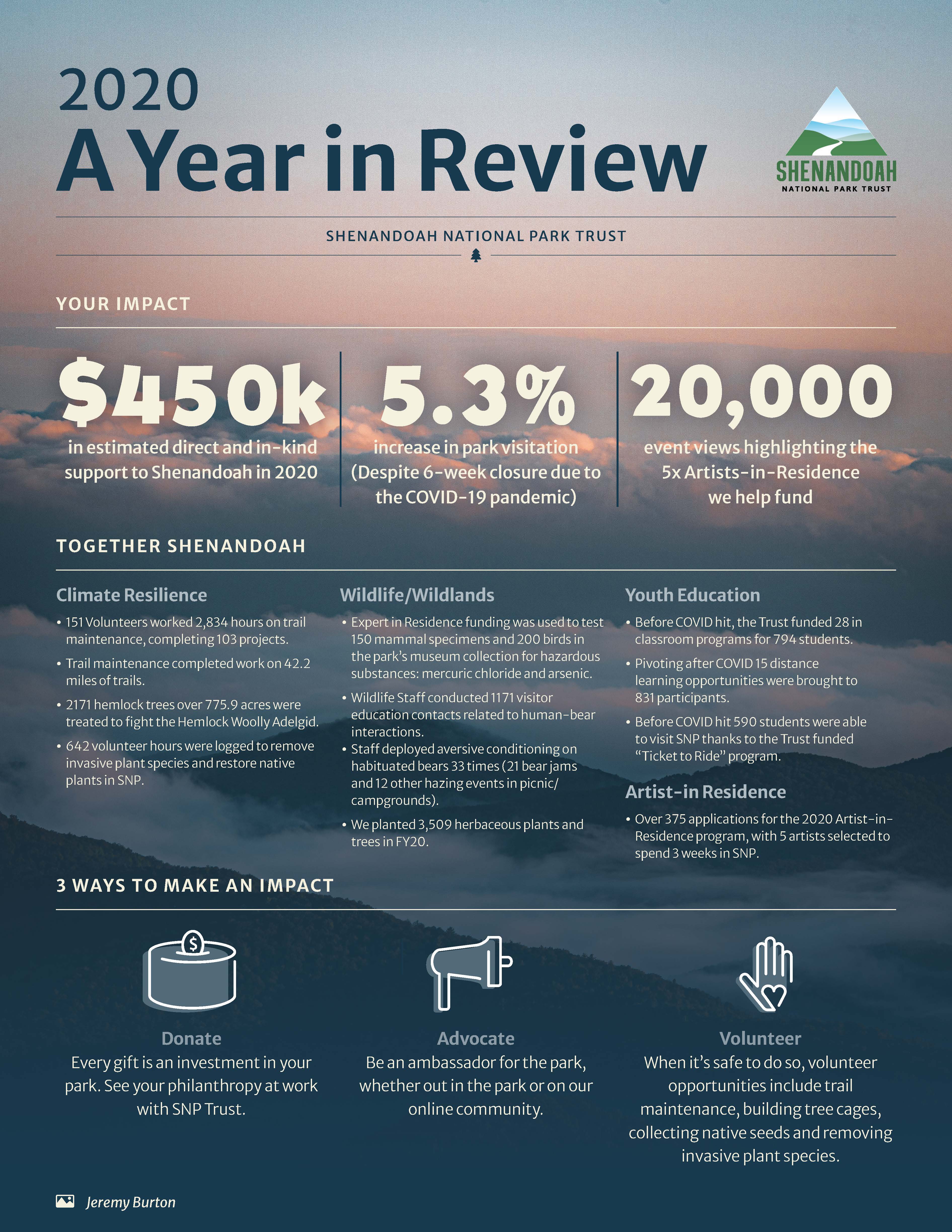
Year in Review Report was an infographic I created to showcase the impact the donors are making. The photo in the background was taken by a volunteer photographer, as were all images that were used in this brand.
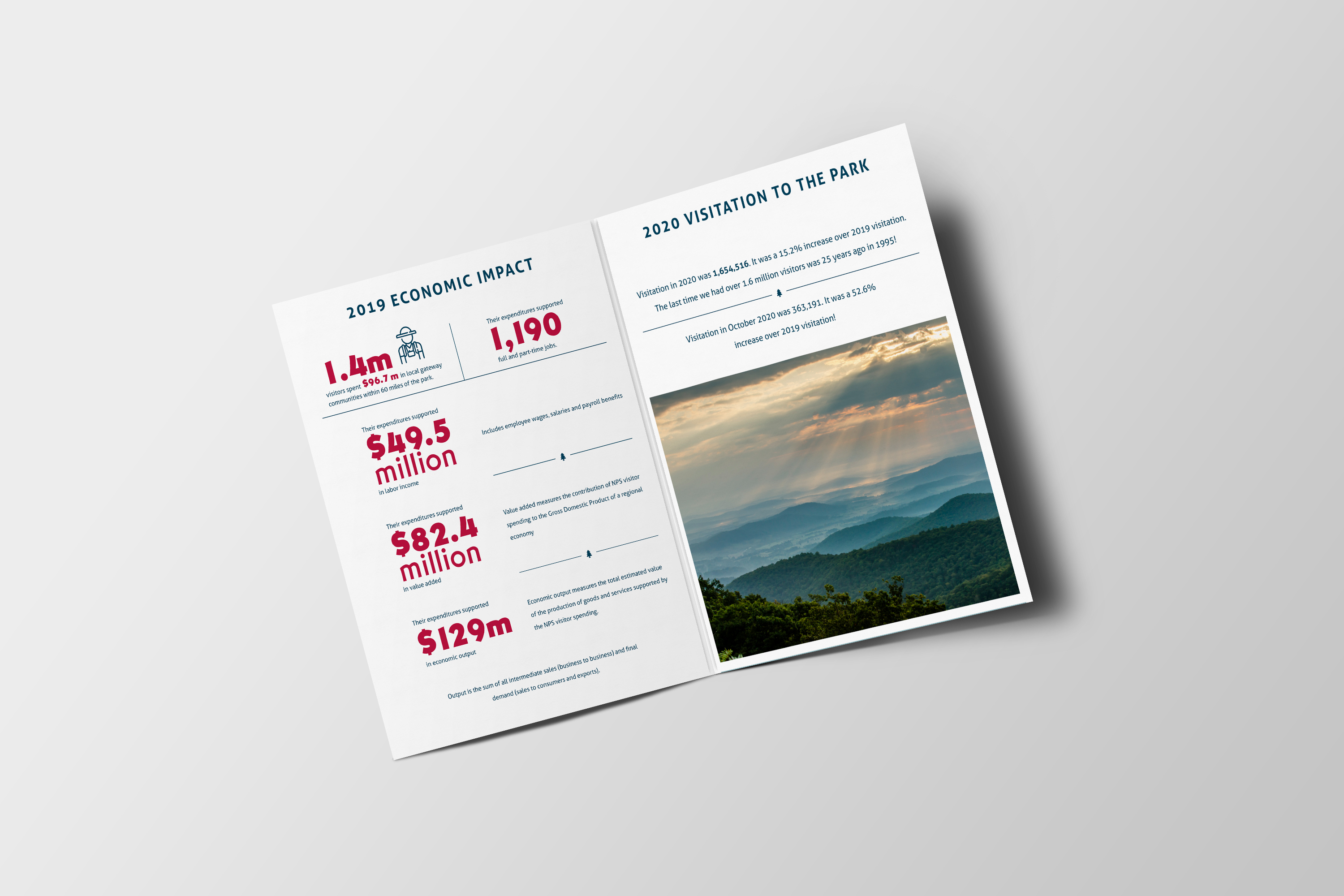
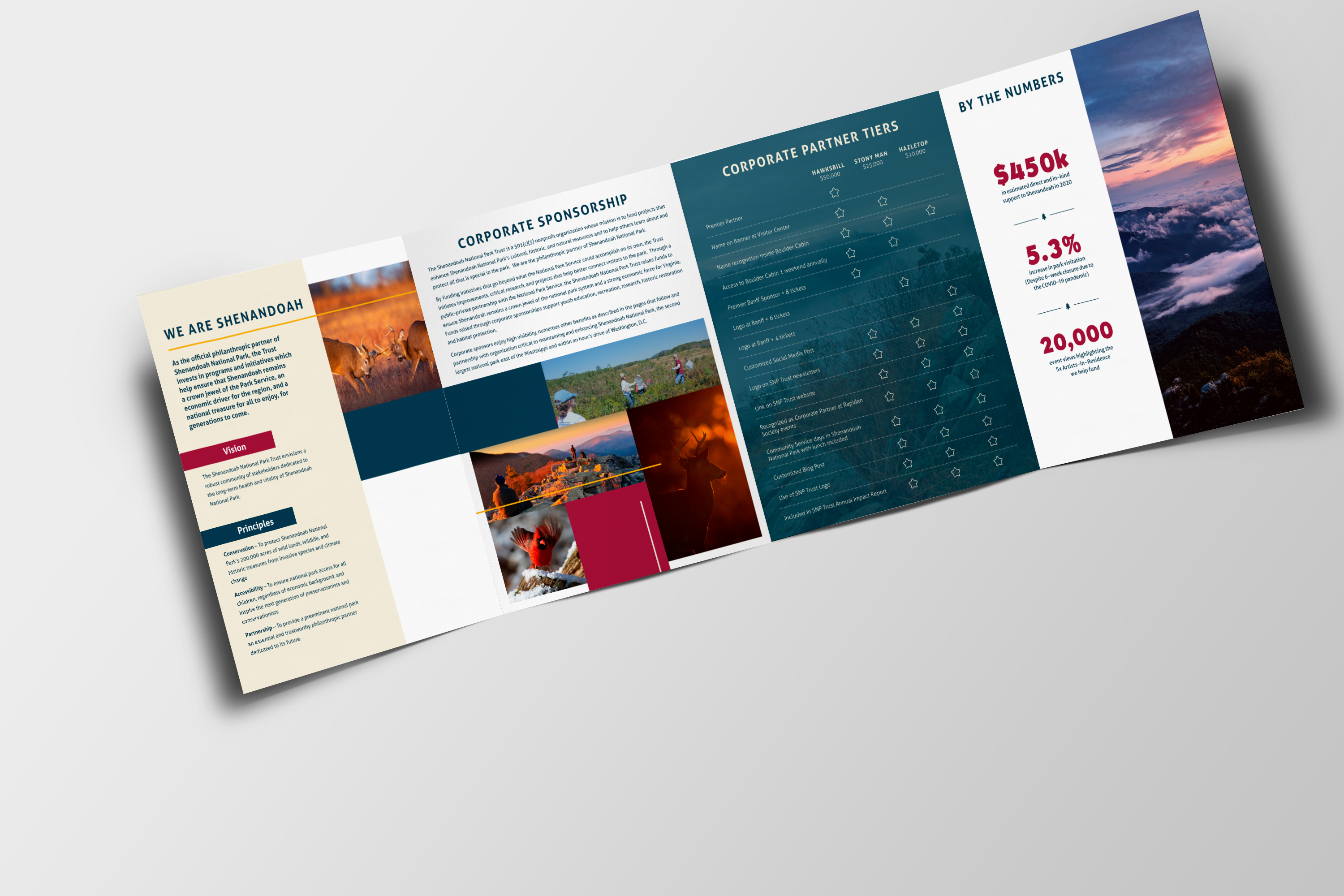
Corporate Partnership Booklet displays useful information for partners of the trust, such as corporate partner tiers, forecasting for the future projects and how donations are being used.


Shenandoah Hiking Adventure is a trail guide for hikers that gives important information about different trails in the parks.

Year end Newsletter was designed in a more block and overlap approach. The ask was to maintain the color palette and the font but change the layout to differentiate it from the other tools. It houses a lot of information that needed to fit in a way that didn’t look awkward or disjointed. With the overlap blocks layout, it allowed the information to be end in places without creating an odd space.


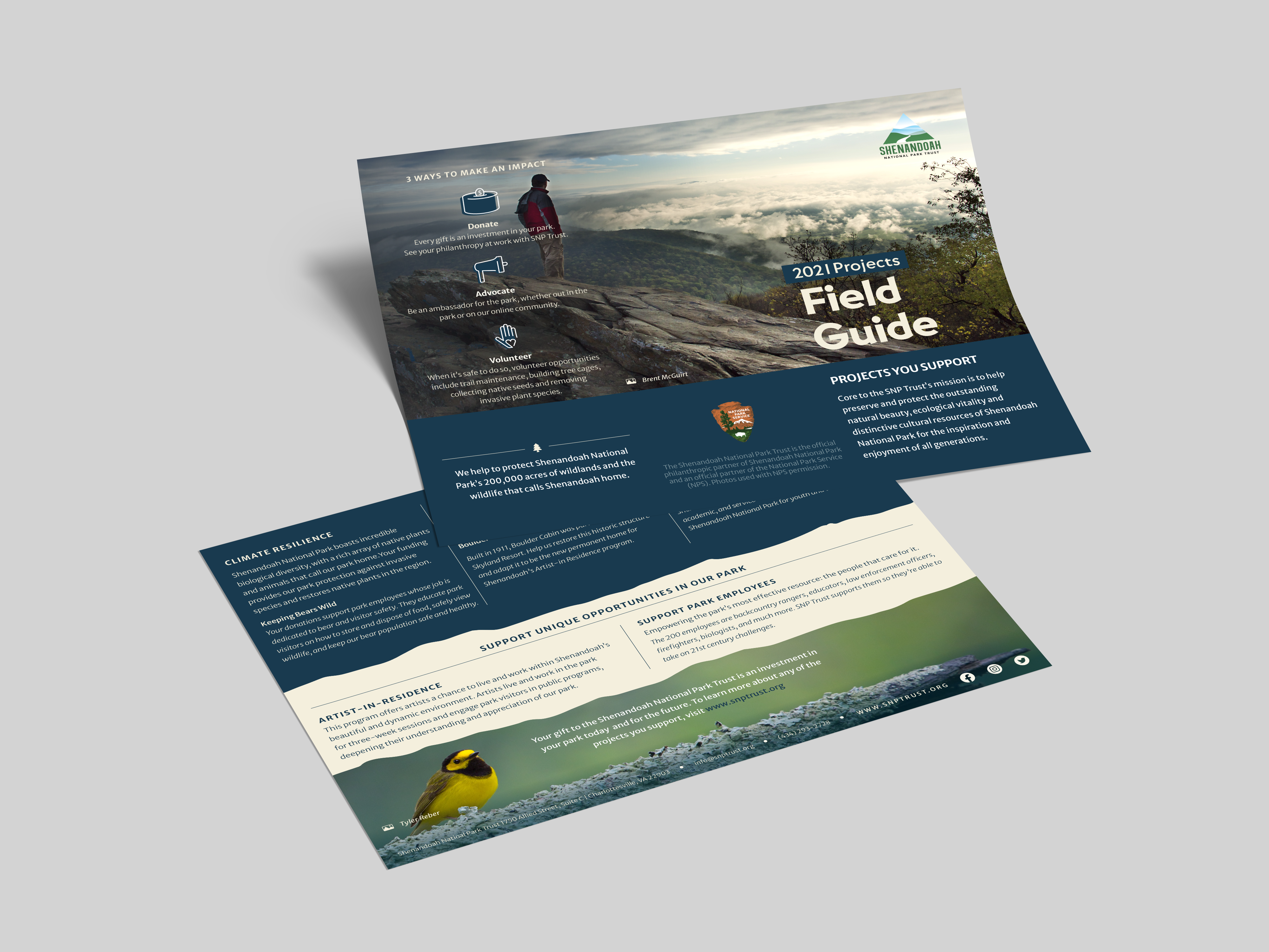
Project Field Guide was designed to be both a tri-fold brochure and a PDF document. It dives deeper into the projects and initiatives the trust deal with.
